Starting From Scratch
Xelhua is a traditional aguas frescas startup that emphasizes 100% natural ingredients and a deep connection to Mexican heritage. I had the opportunity to work with Xelhua from their start, crafting a distinct brand identity that embodied their philosophy of authenticity, quality, and cultural pride. This project spanned the creation of the logo, product packaging, uniforms for their pop-up booth, and collateral materials for market displays.
Building A Brand
The visual identity needed to convey this sense of tradition while also feeling fresh and appealing to a modern audience. The branding was designed to reflect the roots of the product while emphasizing its artisanal, hand-crafted nature.
Lastly, the client wanted the logo to feel already familiar to new customers, inviting more interaction.
DESIGN PROCESS
The logo is inspired by Mesoamerican symbols, particularly referencing the iconic pyramid associated with the brand’s namesake. The bold, geometric typeface reflects strength and authenticity, while the green palette evokes freshness and natural ingredients. It was sketched in Procreate and completed in Illustrator. The result is a logo that resonates with Xelhua’s cultural background while being clean and recognizable.
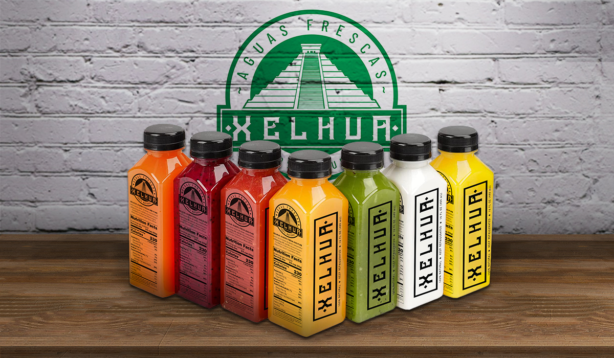
The packaging was created to stand out on the market shelf with a bold, modern, approachable aesthetic. Each bottle's label features a clear representation of the flavor, paired with simple typography that keeps the focus on the natural ingredients. The use of vibrant colors helps distinguish each flavor while retaining a cohesive family look across the product line.
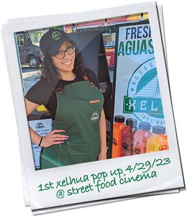
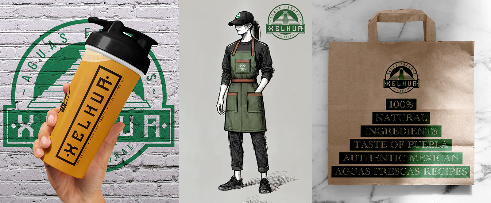
The popup booth and staff uniforms were designed to complete the immersive brand experience. The green aprons evoke the familiarity of a certain popular coffee chain, creating a sense of trust and familiarity, while staying true to the core brand palette. The logo is tastefully displayed to establish brand presence. The overall design of the booth and uniforms evokes an artisanal, farmer’s market feel, inviting consumers to interact with the brand.
Supporting materials, such as reusable shopping bags, were designed with a focus on sustainability and simplicity, echoing Xelhua's commitment to natural ingredients. The typography on the bag references the pyramid in the logo. The visual elements are consistent across all collateral, ensuring a unified brand presentation at every consumer touchpoint.
OUTCOME
The branding for Xelhua has been successful in conveying the essence of the brand—a celebration of cherished recipes and cultural heritage.
The cohesive identity across the logo, packaging, and booth design helps reinforce that Xelhua is all natural, healthy, and handmade.
The design work positioned Xelhua for immediate success in the aguas frescas market, attracting consumers who enjoy traditional aguas frescas but want modern quality and natural ingredients.